Preflight by Flyleaf
A firsthand look at how we think about print — and what it means to do it well. Preflight is a physical magazine that shows what’s possible when materials, specs, and timing are aligned — a real-world example of what thoughtful coordination makes possible.
You don’t need to know every detail about print. That’s our job. But the details matter. From adhesives and coatings to press timing and logistics — every decision has a ripple effect. Preflight shows what’s involved behind the scenes, and how thoughtful planning brings it all together. Every print project is a collaboration. Preflight reflects the kind of partnerships Flyleaf builds — with clients, print partners, and teams who care about quality.
A Closer Look at the Details
Every element in Preflight was selected with purpose — not to show off, but to show how production decisions come together in practice. Below, we walk through the design and production choices behind the piece.
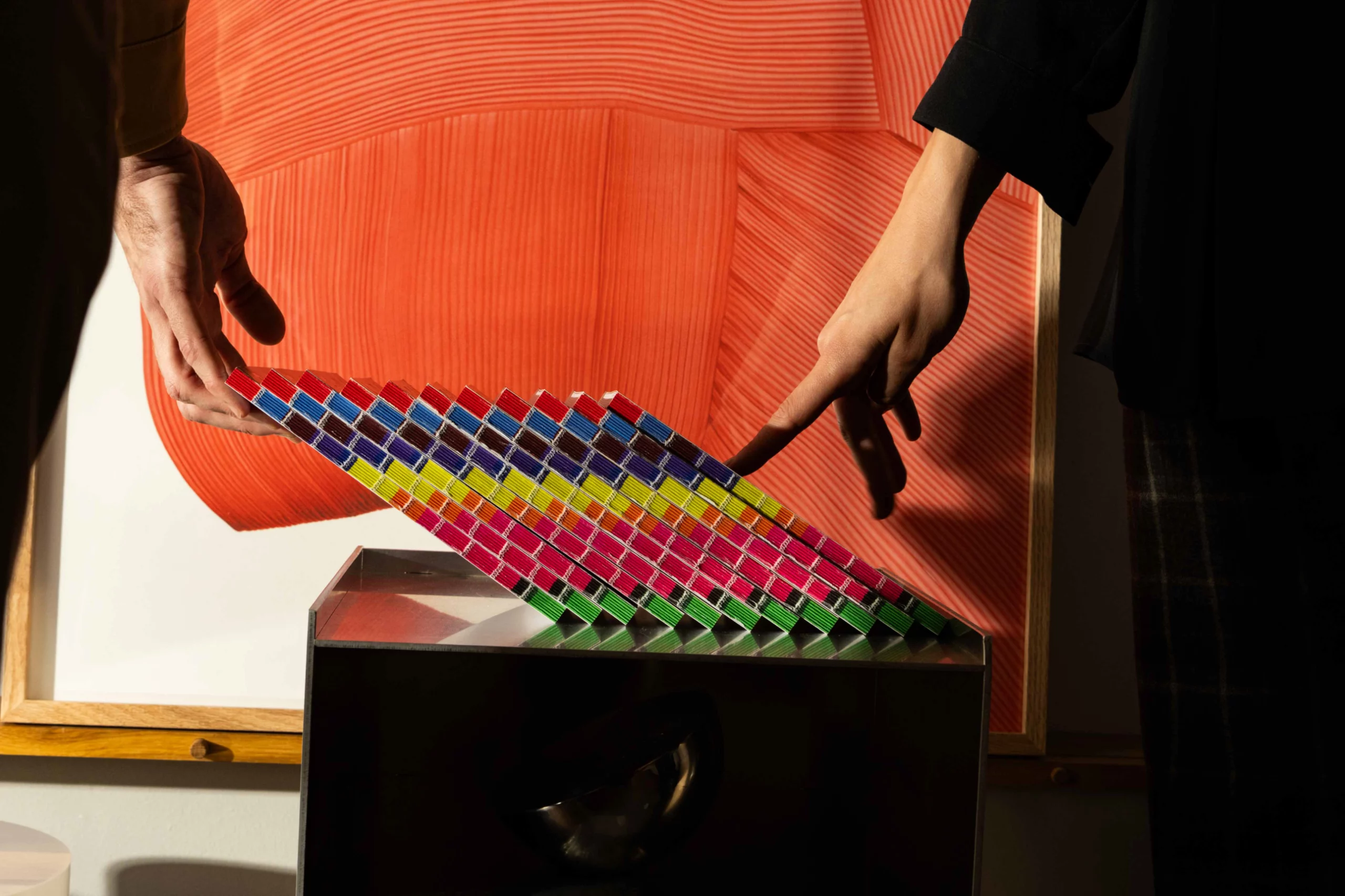
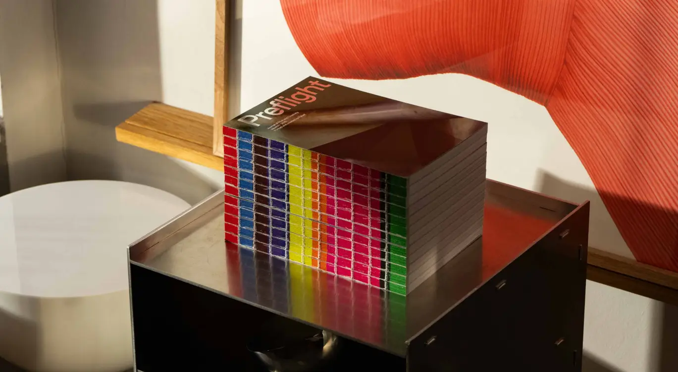
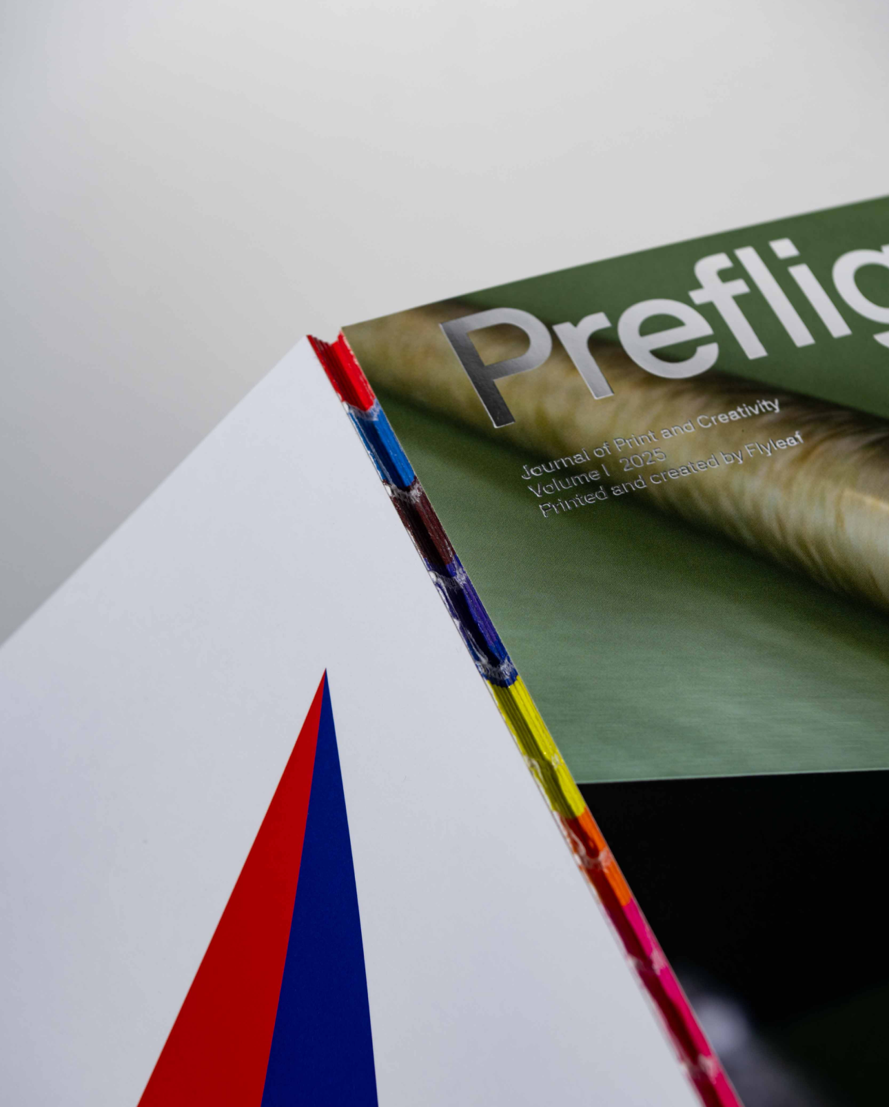
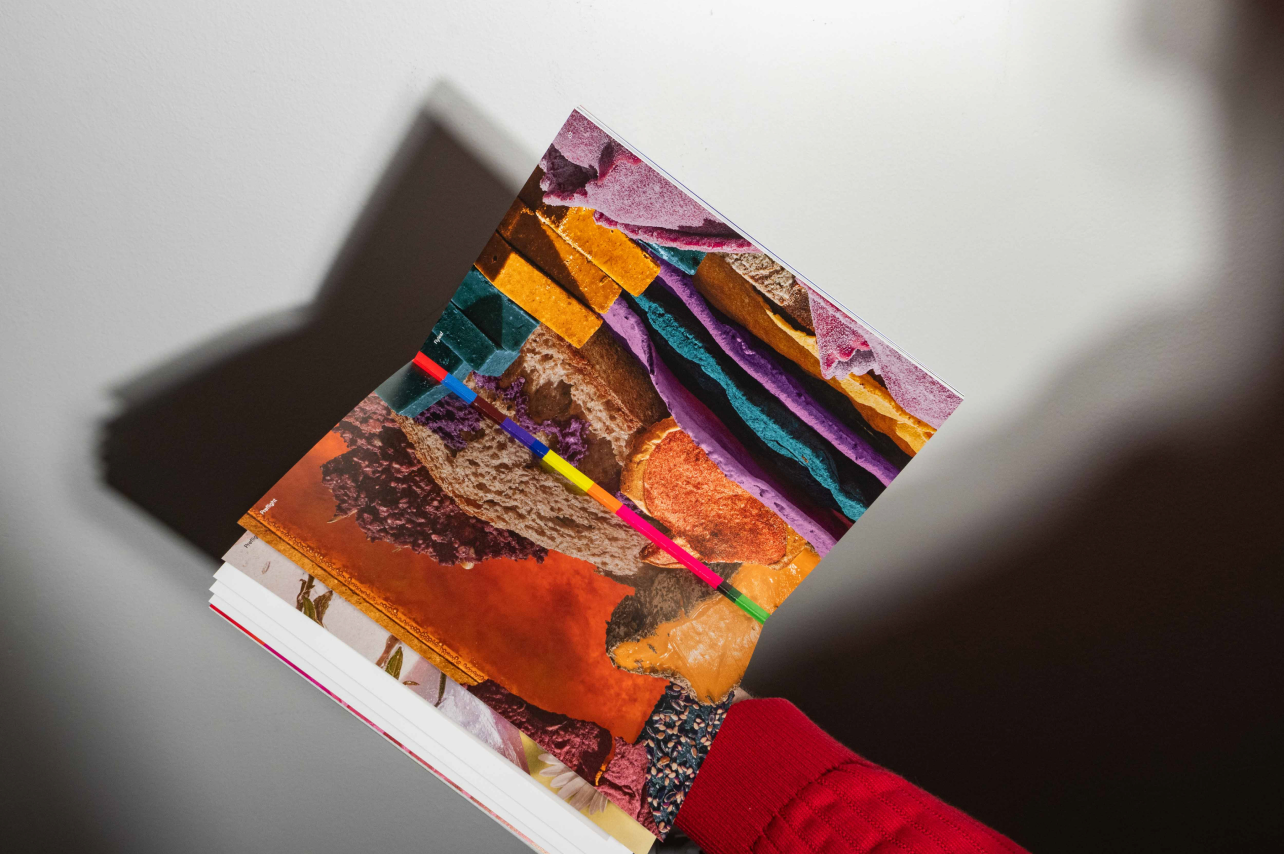
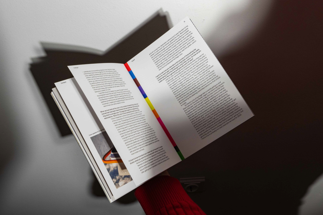
Open Spine: Binding as a branding element
This piece needed to lay flat — no cracking, no bulk in the spine, just a smooth open that felt intentional from start to finish. Standard binding methods introduced too much tension and made the book feel like a catalog. We wanted it to behave more like a design object.
Exposed spine stitching solved for both function and feel. It gave us a clean, flexible opening, and added a visible layer of construction — a signal that the making of the piece was part of the story. We coordinated materials and press setup to make sure the stitching stayed consistent across runs and didn’t distract from the layout.
The result feels technical but tactile — and holds up through flipping, shipping, and display.
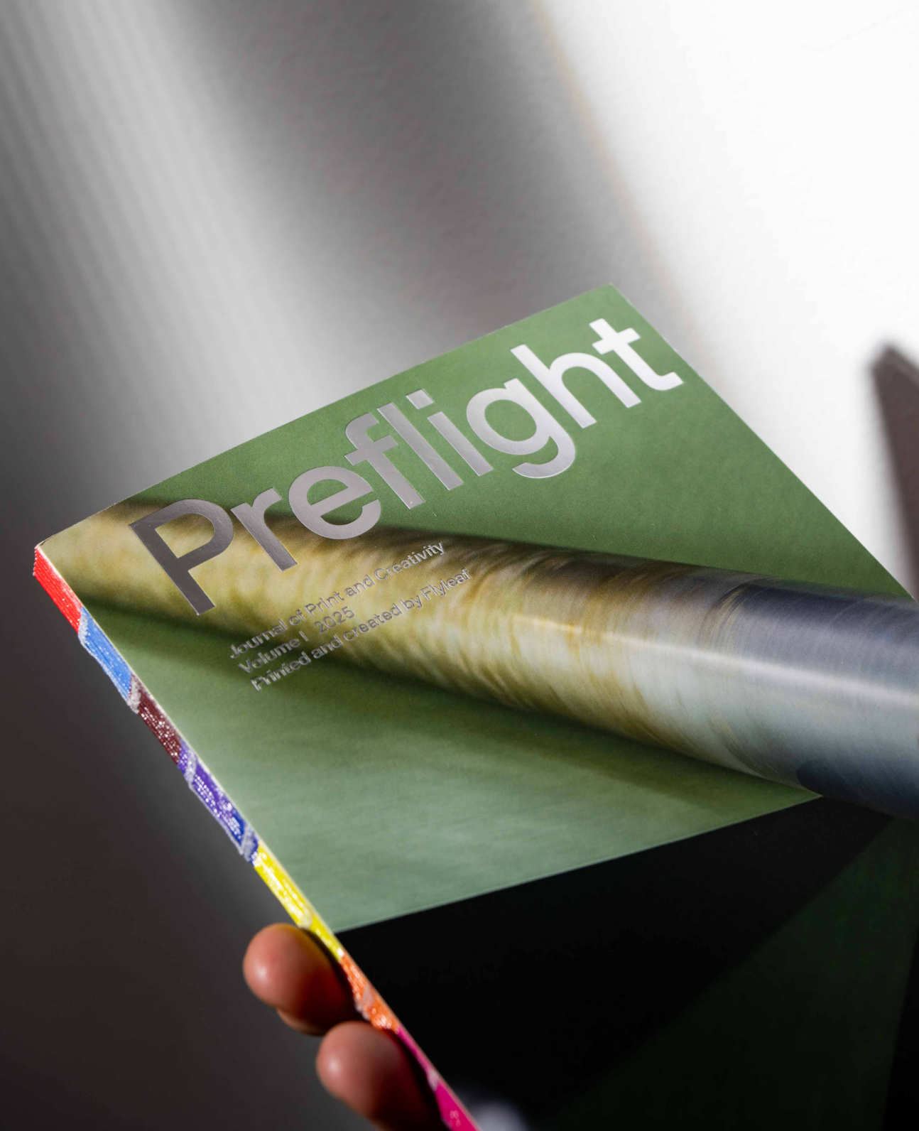
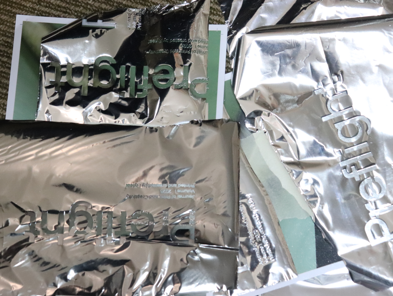
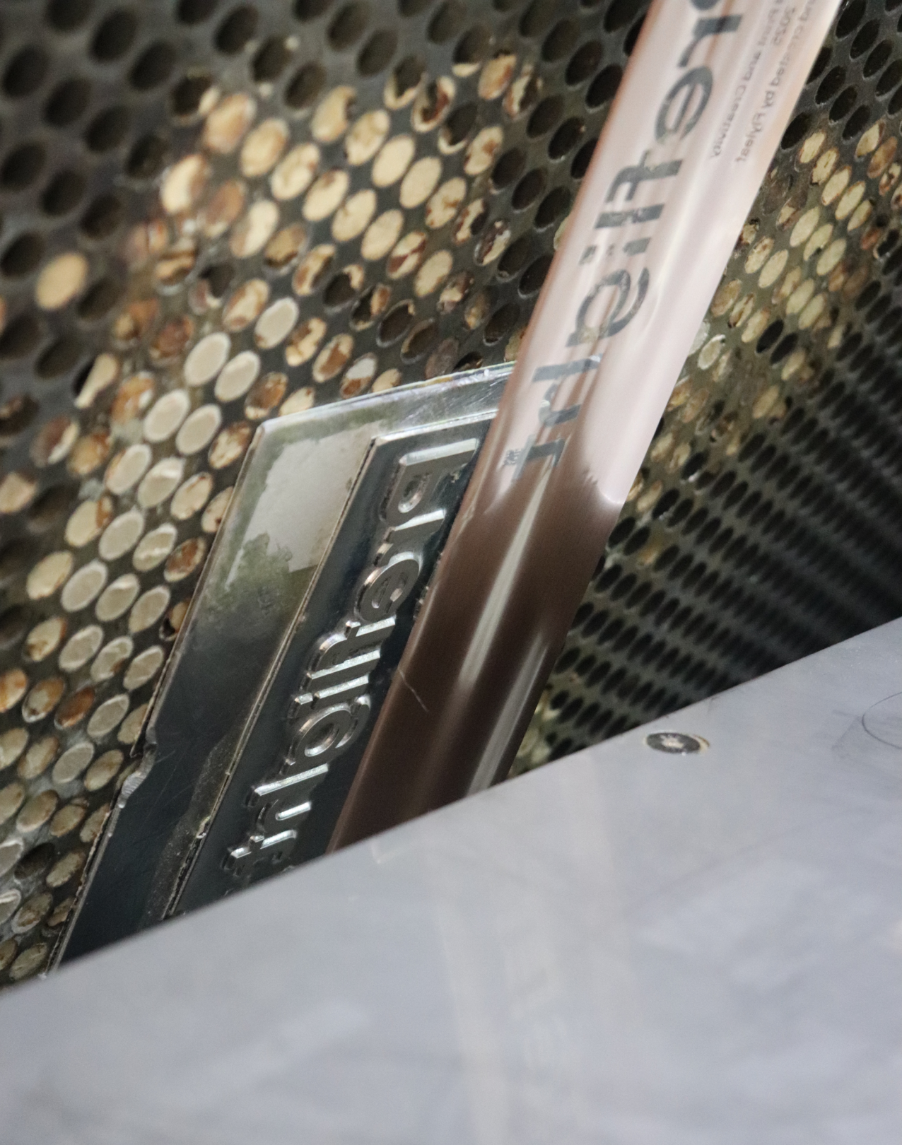
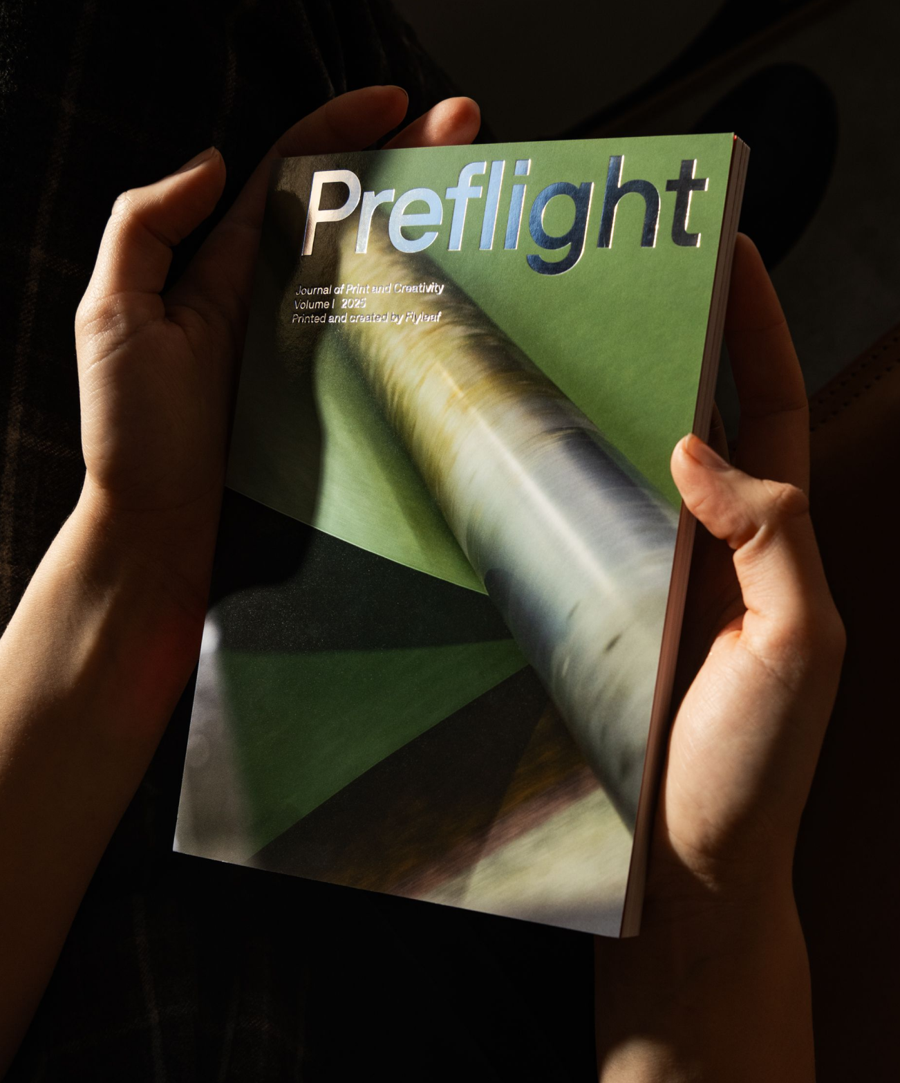
Foiling Mastery: Finishing with Intent
We weren’t trying to make a flashy cover — we were trying to make a durable one that still felt elevated. The goal was a tactile look made to highlight the physical form of the piece, not one that relied on heavy embellishment.
The combination — soft-touch laminate, gloss foil, and an uncoated cover stock — sounds simple, but those materials behave differently under heat and pressure. We tested how each would interact: Would the foil stick cleanly? Would the laminate curl at the edges? Would the cover hold its shape?
Each choice had to work in concert — visually and structurally. The result is a cover that feels intentional in hand, resists cracking or peeling, and balances texture, contrast, and clarity.
OTA Binding, old technique, a new purpose
For this section, we wanted something more unexpected. Saddle stitch binding felt too thin. Perfect binding felt too familiar. OTA — a less common, but highly functional method — gave us something in between.
It holds a square spine like a perfect-bound book, but uses folded sheets that keep the pages secure without relying entirely on glue. That makes it surprisingly durable and easy to handle — especially for pieces that need to travel or stack cleanly.
This was also a reminder: OTA isn’t just for textbooks or manuals. When used thoughtfully, it’s a great option for creative work that’s meant to move.
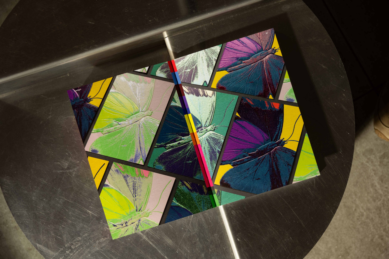
Paper that makes the work stand out
We knew this piece needed to show soft tones, detailed photos, and crisp text — and that meant choosing a paper that wouldn’t wash out or over-gloss.
We selected a thicker sheet that feels substantial in hand without adding unnecessary weight. It’s clean white base holds ink well without looking shiny, and brings out subtle contrasts without muddying the color. We also considered how it would behave on the bindery line — would it score well, fold cleanly, resist scuffing?
The final paper choice wasn’t just about image quality — it was about making sure the entire piece felt cohesive, handled well, and stayed sharp across every copy.
Production Diary
What it took to get this done right
You don’t need to know every detail about print. That’s our job. But the details matter. From adhesives and coatings to press timing and logistics — every decision has a ripple effect. Preflight shows what’s involved behind the scenes, and how thoughtful planning brings it all together. Every print project is a collaboration. Preflight reflects the kind of partnerships Flyleaf builds — with clients, print partners, and teams who care about quality.
A Closer Look at the Details
Every element in Preflight was selected with purpose — not to show off, but to show how production decisions come together in practice. Below, we walk through the design and production choices behind the piece.
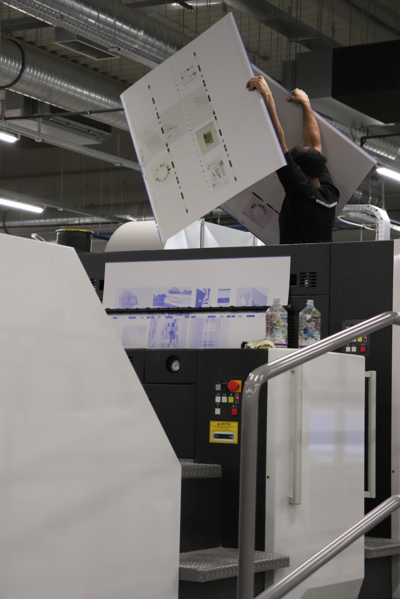
Komori: Why the First Sheet Looks Like the Last
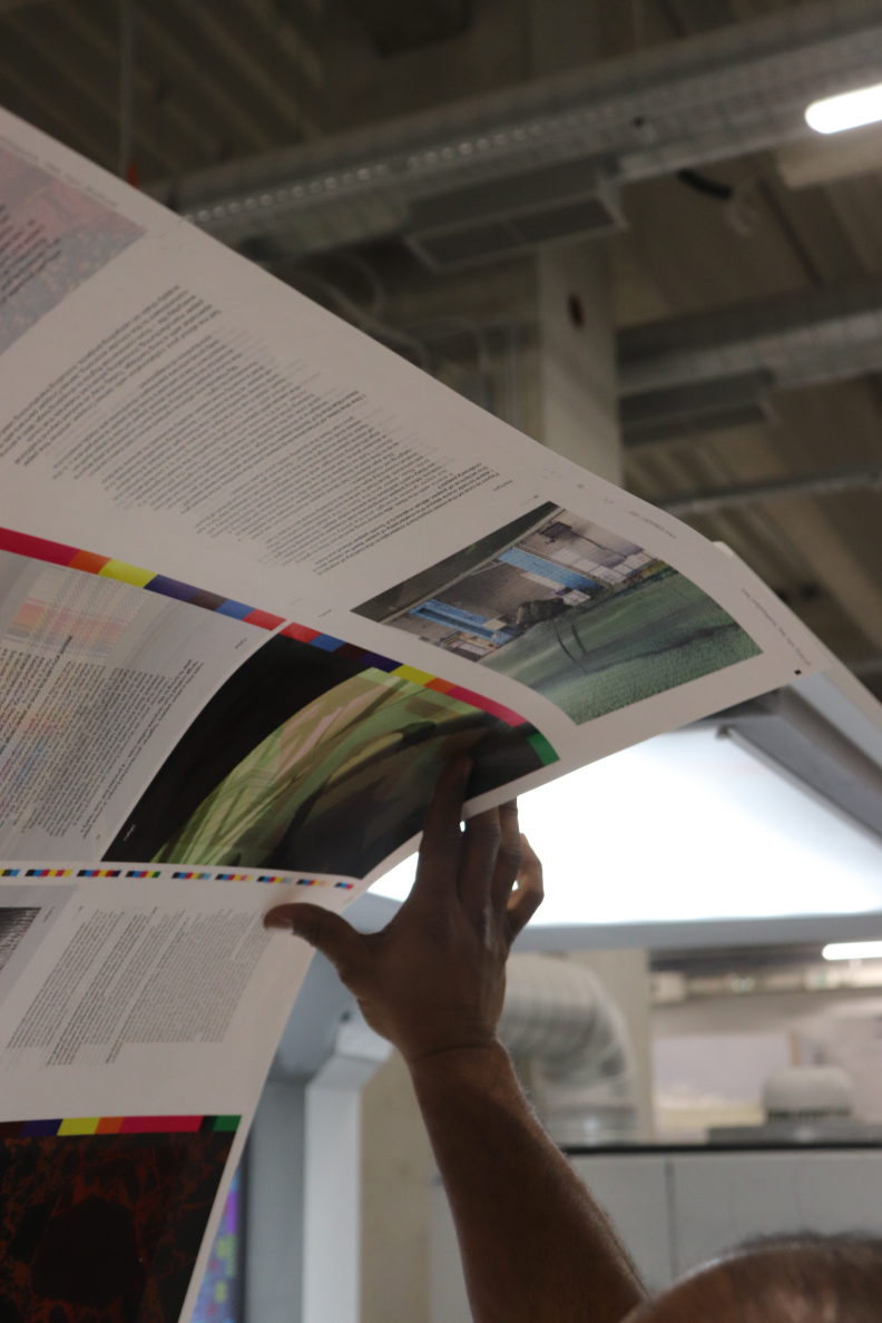
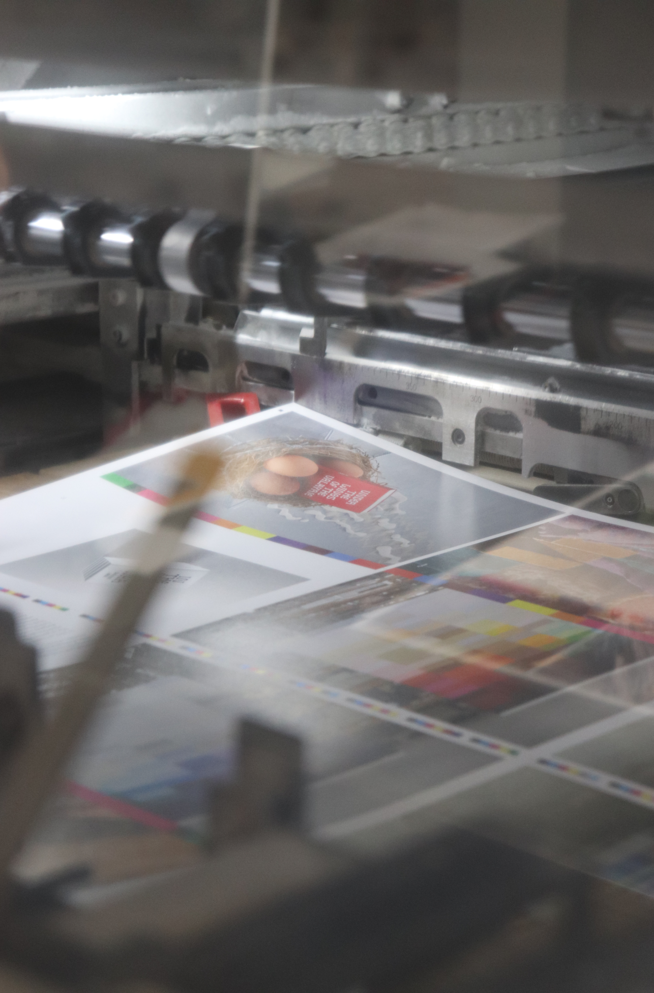
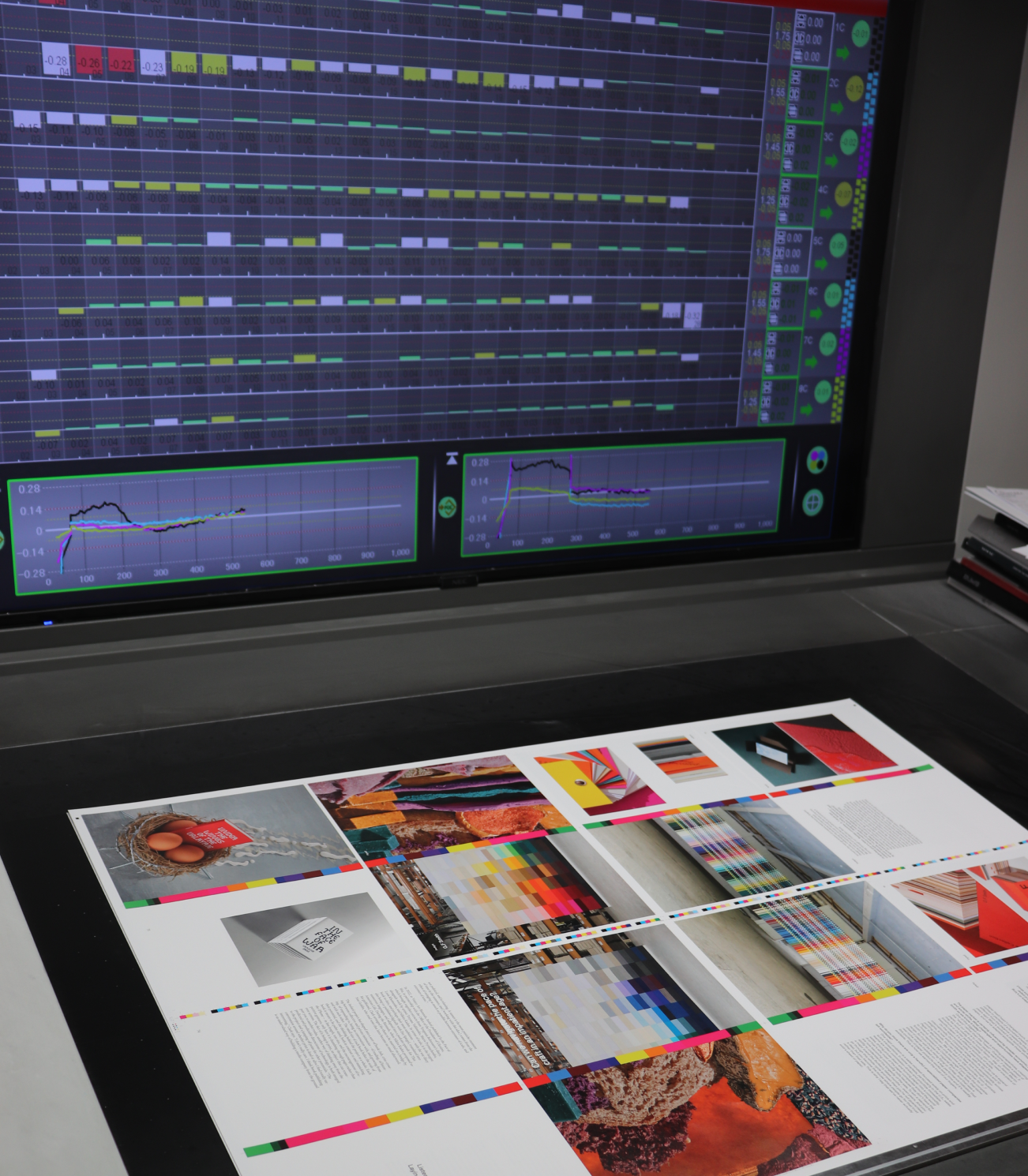
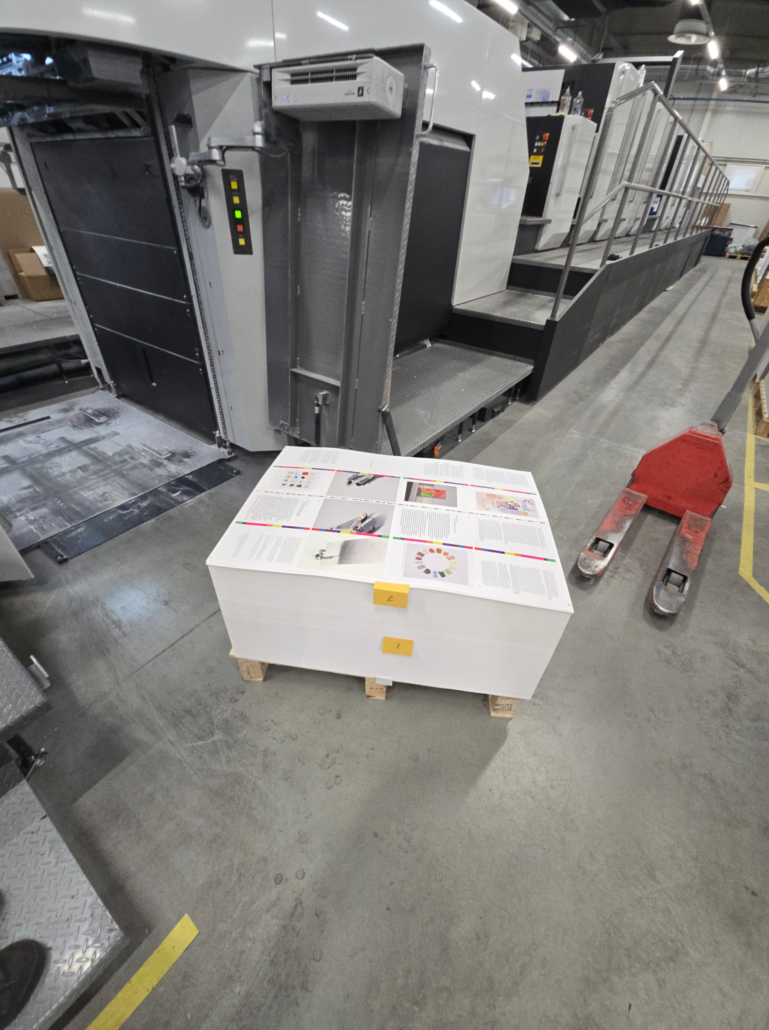
This piece had to be sharp — crisp images, accurate color, and no surprises from copy to copy. We ran it on a modern Komori offset press, known for precision engineering and tight color control.The press adjusts automatically as it runs, holding ink levels steady and alignment tight without stopping for recalibration. That means more consistency, less waste — and a finished piece that feels reliable, page after page.
Paper that makes the work stand out
Photography can fall flat on the wrong paper. Too much gloss can cause glare. Too little can make colors look muted or muddy. We looked for a stock that could balance texture and clarity — something that would hold ink evenly, preserve detail, and give the piece a clean, tactile feel.
We chose Arctic High Volume White 150g uncoated stock for its natural brightness, smooth surface, and ability to carry soft tones without losing contrast. It also held up well on press and in finishing — scoring cleanly, folding sharply, and resisting scuffs during handling. The result is a piece that looks good up close, holds together in use, and feels like it was made with care.
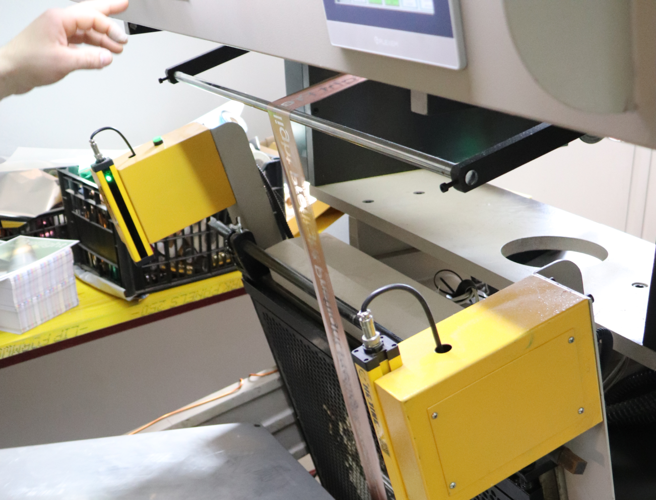
Secondary Production Work: The Work Beyond the Press
Once printing wrapped, the project moved into post-press: foil stamping, lamination, cutting, and binding. The foil work stood out — applied over laminate and uncoated stock, it needed just the right heat, pressure, and alignment to hold crisp detail. We tested ahead to get it right, then kept the sequence moving without delays. A smooth press run doesn’t mean much if the finishing falls short.
Collaboration and Exchange
Let’s Bring This to Life
What you’ve seen on this page isn’t a one-off. It’s how we approach every project — from first-time runs to multi-SKU packaging programs. Every detail, from substrate to shipping, is managed through our three-part model:
- People who know how to manage complexity
- Technology that keeps clients informed
- A manufacturing network built for flexibility
That’s what makes it repeatable, scalable, and dependable — even when timelines get tight or specs change late. Inside Preflight, you’ll also find stories of world-class printers and suppliers — like Sonderegger and GF Smith — partners who share our standards for precision and care.
From business cards to insulated totes, high-end magazines to technical packaging — the same principles apply. Preflight isn’t a portfolio piece. It’s a tool we created to give back to the industry we work in — and a practical example of what good coordination can deliver. Want your next project to run like this? Let’s talk.