Love it or hate it, Jägermeister’s blend of 56 herbs, blossoms, roots, and fruits delivers an unmistakably intense flavor that has made it a staple in bars and clubs worldwide. The iconic herbal liqueur, housed in its signature square bottle traditionally crafted from amber-tinted glass, is now being reimagined for a new generation with the help of Pantone Color Institute. We caught up with Jägermeister’s branding team to delve into how they’re blending heritage, community, and celebration while giving the brand’s iconic colors a fresh, contemporary makeover.
Jägermeister’s bottle packaging is iconic and highly recognizable. What inspired the decision to make such a bold change to the bottle’s appearance with this collaboration?
Our iconic bottle is known all over the world. Through our collaboration with PANTONE, we are further sharpening our global brand identity. The idea is to strengthen the visual appearance in the long term and strike the right balance between tradition and contemporary brand communication.
As part of our global BVI development, we wanted to standardize our color palette to ensure global brand consistency across our markets around the world. Working with the experts at PANTONE, we develop a cohesive set of color codes designed to work not only across national borders but also across a variety of materials.
What role do colors like Herbal Green and Culture Orange play in Jägermeister’s brand identity, and how did Pantone help you refine or expand on these meanings?
Jägermeister is known for its iconic and unique color combination of green and orange. Everything the brand stands for can be traced back to these two colors: our deep connection to nature and craftsmanship, and our passion for unforgettable nights out and urban culture. So, it made sense to create a campaign that focuses on these colors. Jägermeister has become more and more of a lifestyle brand in recent years. People love our products, our colors, and our attitude towards life. By working with PANTONE, we are capturing the zeitgeist and playfully bring our core colors to life for fans of the brand.
In this collaboration, certain elements—such as the omission of the front label and the inclusion of Pantone color swatches—mark a departure from your classic design. What impact do you think these choices will have on brand perception and customer engagement?
These two iconic colors are central to our identity and will always be integral to everything we do. The consumer has been at the heart of the development of the exclusive packs, and we are seeing more and more that design, limited editions, and exclusive, innovative products are in high demand among our target group. Our packs were sold out in Germany and other markets within minutes – this shows us that we’re meeting these expectations and staying relevant.
It’s incredibly rewarding to see the success of our new designs and to know that we’ve captured the spirit of the times by bringing the Jägermeister colors into a contemporary context.
Can you share the thought process behind choosing matte coatings for the limited-edition bottles? How do you feel this finish impacts the overall perception of the brand?
Providing additional value is always our biggest goal when creating exclusive editions. The matt finish gives the bottle a special look that has never been seen before. A special collector’s item that our fans have snatched out of our hands.
The collaboration with Pantone has taken Jägermeister’s color palette to a new level, especially with the monotone collector boxes. How did you decide on the details for each box, and what were the challenges in executing this concept?
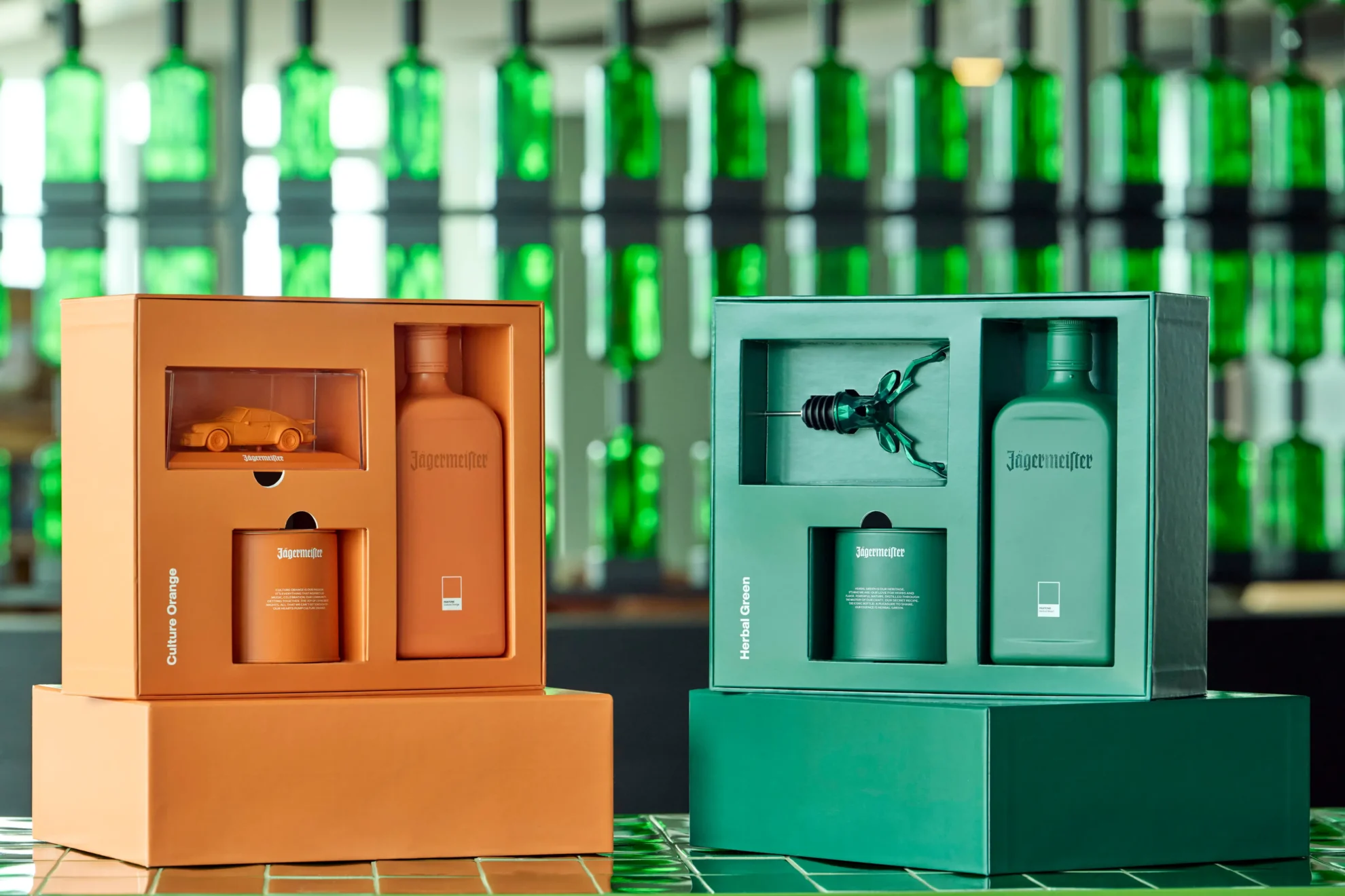
The aim was, of course, to integrate core elements and facets of the Jägermeister brand into the design as well as staying true to the design legacy of PANTONE. The color tins with the shot glasses reflect this deep connection of both brands.
Star of the orange design pack is – next to the matt bottle – also the Porsche Carrera 911. It symbolizes the brand’s connection to historic motor racing. Jägermeister made motorsport history between 1972 and 2000. The Porsche Carrera RSR remains a special icon among Jägermeister racing cars to this day and is part of the Rennmeister brand that was founded to mark the 50th anniversary of Jägermeister’s racing history. It takes a new and unconventional look at the iconic Jägermeister racing cars – as contemporary witnesses to an adventurous era of sport, pop culture, art, and design, they span the arc from the roots of the Jägermeister racing team to the here and now. The stag’s head spout in the green package stands for our heritage, the product and 56 natural ingredients of Jägermeister.
Brand collaborations are becoming more common, but color-focused partnerships are rare. What do you think sets this Pantone collaboration apart from other brand partnerships, and how does it reflect Jägermeister’s vision for the future?
Pantone represents the power of color and the significant impact it has on consumer behavior, influencing emotions, perceptions and purchase decisions. Jägermeister x Pantone is a testament to this power and demonstrates the potential for a quick and impactful way to communicate a message without words. This collaboration with Pantone allows us to hone in on the duality of the Jägermeister brand, which is deeply rooted in our DNA. Our brand colors are great examples of how this duality is expressed visually and will always play an important role in our communications.
Looking ahead, do you see Jägermeister exploring more collaborations that allow for creative flexibility with iconic brand elements, or is this a unique one-off with Pantone?
These two iconic colors are central to our identity and will always be a cornerstone of everything we do. The success of our lifestyle products and innovations with our fans underscores their appeal. Limited editions will remain a key part of our journey, giving fans plenty to look forward to in the future.


